Armchair Authority: A Luxury Editorial in Studio
I wanted relaxed authority — a shot that reads expensive without trying hard. Here's exactly what I picked in Studio and what came back.
I wanted a shot that reads expensive without trying hard.
Not a red-carpet pose. Not a power stance. Something more like: this is my library, I've been here a while, and I'm not getting up anytime soon. Relaxed authority. The kind of editorial image that fashion brands use when they want the clothes to feel inevitable rather than aspirational.
So I opened Studio and started picking.
How Studio actually works
If you haven't used Studio before, the main thing to know is that it's form-first. You don't open a blank text box and try to write a perfect prompt — you pick from menus. Camera Lab handles the photographic side: body, lens, focal length, aperture, lighting style. Pose Library, Camera Angle, Background, Makeup, Fashion, Location — each section adds a layer. When you're done picking, Studio assembles the full prompt for you. You can read it, tweak it, or just hit generate. Most people never need to touch the assembled text at all.
What I picked from Studio
Armrest Recline (Pose Library — Full Body)
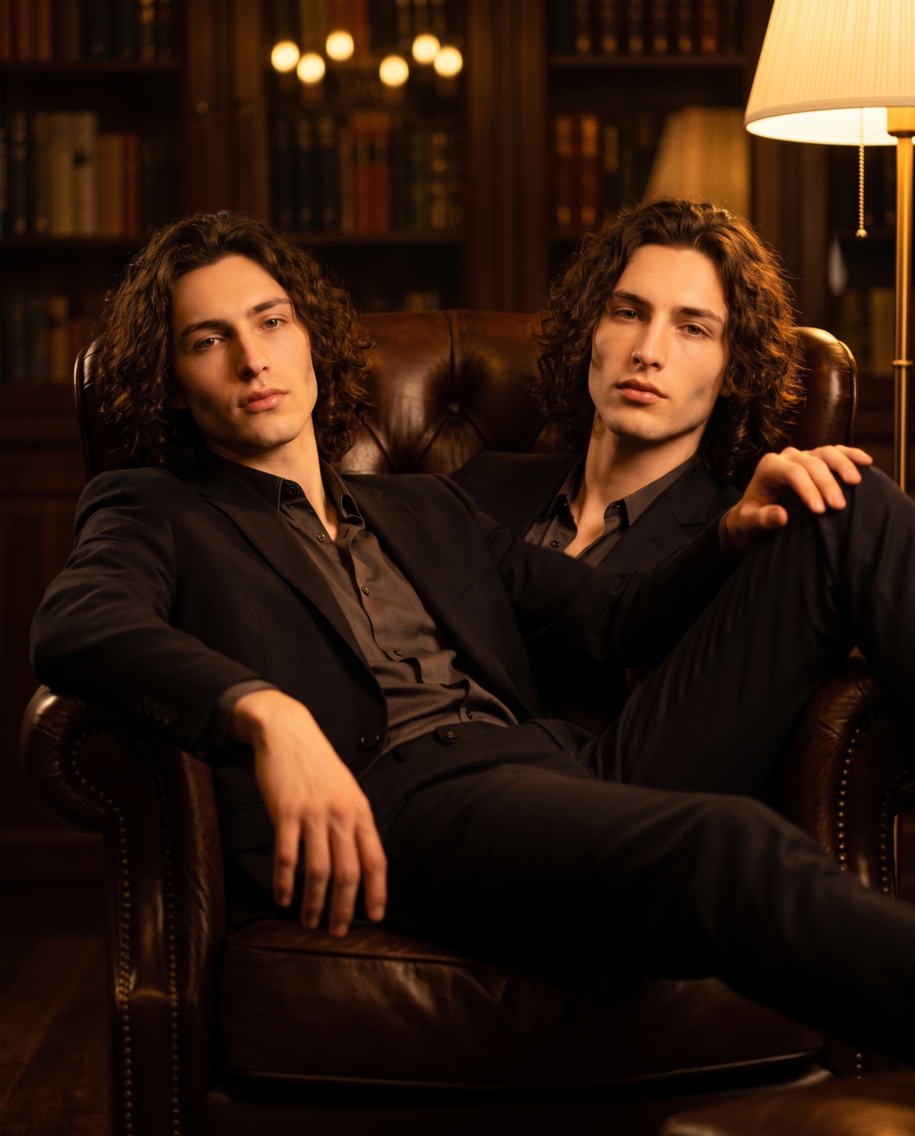
The catalog description says it plainly: model reclined in a chair, one arm draped over the armrest, other hand resting on the opposite thigh, legs extended. What it doesn't say is how much that specific geometry does for the feeling of a shot. The draped arm creates a long diagonal line across the frame. The extended legs push weight into the floor. The body says "settled" rather than "posed." I picked this because I didn't want a fashion-dummy shot — I wanted something with stillness and weight to it, the kind of body language that implies the subject has been somewhere for a while and is comfortable with that.
3/4 Right (Camera Angle)
The catalog calls this the classic portrait angle from the right — natural depth and dimension. It's the workhorse of editorial photography for a reason. A straight-on shot would have flattened the pose into a diagram. A hard side angle would have lost the face. The 3/4 right gives you both: you read the full pose AND the face has presence. For a reclined figure especially, that slight rotation is what separates "catalogue product shot" from "magazine spread."
On the lighting side — and this connects to one of Studio's core operating principles — Lighting Sets the Mood. I wrote warm amber tungsten light directly into my scene description, paired with a dimly lit private library and dark wood shelves. That combination is doing a lot: the warmth fights against any clinical coldness the AI might default to, the dim library anchors the "private, unhurried" mood, and the soft bokeh on the background keeps all the attention on the figure. If I'd swapped to high-key fashion lighting, the same pose would have read completely differently.
The assembled prompt
This is what the form composed for me — you don't have to write any of this yourself unless you want to.
A young man with dark curly hair, porcelain skin, and sharp angular jaw reclined in a deep leather armchair — one arm draped loosely over the armrest, the other hand resting on his opposite thigh, legs extended with casual confidence. Shot from the front-right at a natural 3/4 angle, creating depth and dimension. Warm amber tungsten light falls across his face and chest. Background: a dimly lit private library, dark wood shelves, soft bokeh. Luxury editorial mood, cinematic and unhurried.Worth knowing while you're in there: I picked myself as the character when setting up this session, which auto-loaded my reference photos and locked my face and body into the generation. Studio calls these Character Refs — pick any character from your roster, and the model maintains visual continuity across every shot. If you're building a campaign around a specific AI persona, this is the feature that makes it coherent rather than accidental.
What I noticed
The thing that surprised me most was how well the leather armchair read as specific rather than generic. I didn't upload a reference image of a chair — I just described it in the scene. The model filled in a deep, high-backed piece that matched the library mood without me having to direct it explicitly. That's good contextual inference.
The lighting landed close to what I had in mind. The amber falloff across the chest and face creates a warmth that feels lived-in. One thing I'd adjust in a next iteration: I'd bring the background library shelves into slightly sharper focus — not a lot, just enough to confirm the setting without making it fight for attention with the figure.
Overall: this is a usable editorial shot. Not a test image, not a mood board reference — something I'd actually publish.
What it cost
- Credits spent: 2.70
- What you'd pay: $0.27
- Generation time: ~28 seconds
4K output, 4:5 aspect ratio. For a shot that could anchor an editorial post or a campaign header, $0.27 is not a number worth arguing about.
If you want to try this yourself, open Studio and start with the Pose Library. Pick a pose, pick a lighting mood, pick an angle — the form composes the rest. You don't need to write a word.
— David
See what others are making


Each image links to the character's profile. The Studio — Technical Guide has the full showcase plus deeper documentation on every component.